skip to main | skip to sidebar

Saturday, November 22, 2008

Nominal Area Choropleth Map

https://courseware.e-education.psu.edu/courses/geog482/graphics/citationexample.jpg

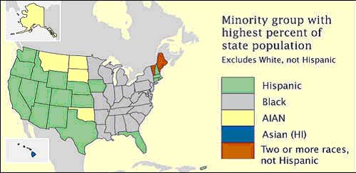
Nominal Choropleth maps organize and show data that is based on a nominal category rather than one that is capable of being ranked. This particular nominal area choropleth map shows which minority group has the highest percentage population in each one of the 50 states.

Posted by chh04 at 6:55 PM

No comments:

Post a Comment

Newer Post Older Post Home
Subscribe to: Post Comments (Atom)

Miraculous Maps...

Blog Archive

  • ▼  2008 (50)
    • ▼  November (44)
      • Star Plots
      • Box Plot
      • Histogram
      • Parallel Coordinate Graph
      • Triangular Plot
      • Windrose
      • Climograph
      • Population Profile
      • Scatterplot
      • Index Value Plot
      • Lorenze Curve
      • Bilateral Graph
      • Nominal Area Choropleth Map
      • Unstandardized Choropleth Map
      • Standardized Choropleth Map
      • Univariate Choropleth Map
      • Bivariate Choropleth Map
      • Unclassed Choropleth Map
      • Classed Choropleth Map
      • Range Graded Proportional Circle Map
      • Continuously Variable Proportional Circle Map
      • DOQQ
      • DEM
      • DLG
      • DRG
      • Isopleths
      • Isopachs
      • Isohyets
      • Isotachs
      • Isobars
      • LIDAR
      • Doppler Radar
      • Black and White Aerial Photo
      • Infrared Aerial Photo
      • Cartographic Animation
      • Statistical Map
      • Cartogram Map
      • Flow Map
      • Isoline Map
      • Proportional Circle Map
      • Choropleth Map
      • Dot Distribution Map
      • Propaganda Map
      • Hypsometric Map
    • ►  September (6)

About Me

My photo
chh04
View my complete profile